SavingsOak mobile app for filing expenses on the go
Overview
SavingsOak is Health Savings Account platform for small and medium business employers and their employees.
What sets Savings Oak apart from other HSAs is their goal of turning savers into investors.
The problem
The client has asked the UX team to build a mobile application that allows the users to file and view their medical expenses.
Key use cases for the app include the ability to:
File medical expenses with receipts.
Keep expenses in drafts until they are ready to file
Choose between reimbursing money now or investing and reimbursing later.
See a list of all the filed expenses (refunded, deferred, potential return over time.)
Primary users
Employees who want to track medical expenses on the go
Employers who want to offer employees a HSA mobile app
What do I want to learn?
What are the best practices for workshop facilitation?
How many and what activities make for a delightful learning experience for a workshop facilitator?
Is there a "sweet spot" for a workshop length of time?
How do you create a safe environment for participants to share ideas free from judgment?
My role
Lead UX design and research
Process
Competitive analysis
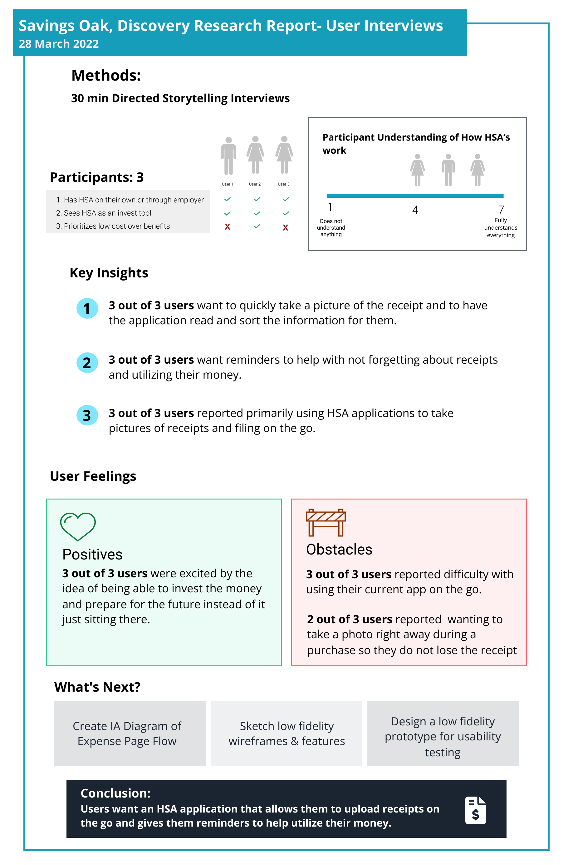
User interviews
A/B usability testing
Empathy map
Low-fidelity prototype
High-fidelity interactive prototype
Information architecture
Tools Used
FigJam
Figma
Adobe suite
Google suite
Zoom
Dropbox
Team
Stephen Magner
Danielle Byers
Jamie Tan
Ryan Thoemke
Role
Lead UX design and research
Type
Mobile app
Deliverables
Findings and recommendations report
High-fidelity interactive prototype
Client presentation
Discovery Research
Figma whiteboard detail


Findings and recommendations
A/B Usability Test
30 minute, task-based, tests were conducted with 4 participants using two low-fidelity prototypes.
Evaluation Goals:
Evaluate the degree to which users can upload and file a receipt
Evaluate the degree to which Users under the homepage and how to get to the expense page
Evatule the users' understanding of the types of receipt filing processes (deferred, pending, paid)
Evaluate the user’s ability to filter receipt categories on the expense pageKey
Differences:
Homepage layout
Camera feature vs upload only
Presence vs absence of a bottom navigation bar

Homepage comparison
Findings
3 out of 4 users prefer the infographic, it clearly shows how HSA funds are distributed between investments, claimed and deferred.
3 out of 4 users were drawn to the green button; however, they didn’t know what it was for.
3 out of 4 wished they could see a clear image of the available balance.
“Maybe the design isn’t using the screen efficiently. Perhaps you might tighten up the layout so that there’s more stuff on the page, so there’s less scrolling.”
Recommendations
For the next design iteration of the home page:
Add infographic
Prominently place an invest button and available balance
Add a label to the green button

Expense upload flow
Camera vs Upload Only
We compared the two versions of uploading an expense:
A: Upload by taking a photo only
B: Upload from device only
4 out of 4 users appreciate the ability to snap a photo while they are on-the-go.
2 out of 2 users, who saw prototype A, were confused by their progress during the receipt uploading process.

High-fidelity interactive prototype
Users spoke to us and we listened. One thing we wanted to focus on was creating a homepage that is simple while really concentrating on our 2 big goals. Users told us how much easier it is to understand where their money is through visual infographics.
We were tasked with creating a seamless expense filing flow. While interviewing users, everyone exclaimed how important it was to be able to file an expense on the go.
Another insight from our users was to add a feature for the user to learn more about investing and FAQs.
To encourage users to invest instead of spend, we created a gentle reminder overlay disruptor asking “are you sure you want to reimburse? You can also see the top right green “invest” button on the home page that draws the user’s eyes in. We also included it in both menus. There should never be a question of where the user can find investments information.

Landing page

Invest now overlay
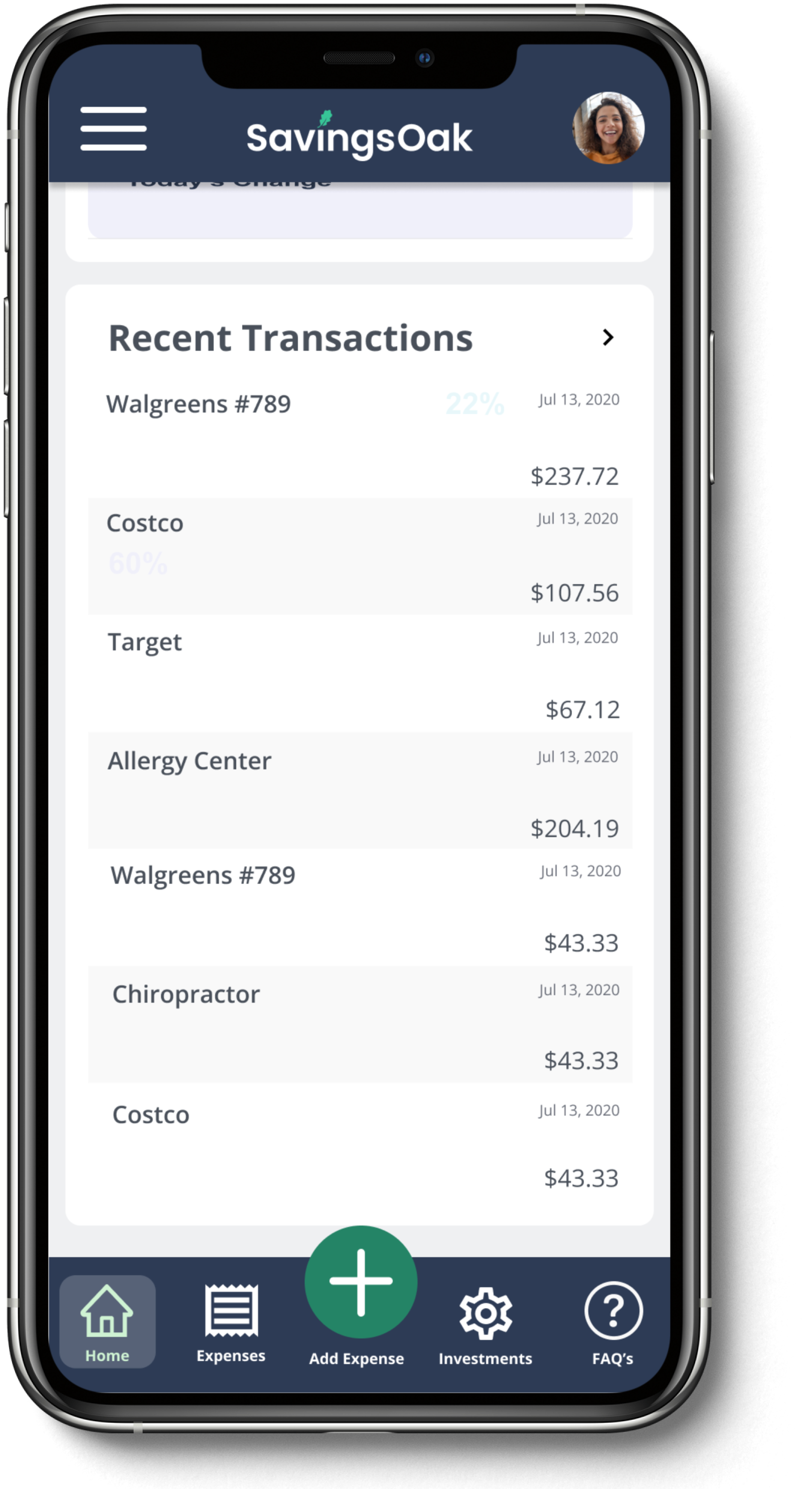
Recent transactions

Camera feature to photograph and scan receipts
Conclusion
We feel that based on our research, we achieved the goal of the client and users by creating a mobile app for filing expenses, saving and investing money.
In addition, developing the mobile app will give users a way to file expenses on the go and see a glimpse of funds in their HSA account.