Hope Community
Overview
Hope Community is a non-profit that makes community connections through racial equity and diversity—located in the Phillips neighborhood of Minneapolis.
What they want to learn
Hope Community staff, leadership, and stakeholders wish to evaluate how well the current website serves its audiences. They'd like to learn how to serve the community better and reach its intended goals through the website evaluation process.
Site goals
Communicate Hope’s goals, mission, and values
Provide information on how to participate in Hope programming
Appeal to donors by communicating the work efforts and resulting impact
Primary users
Potential donors/funders: interested in understanding Hope’s work and values
Current donors/funders: wanting to see how their donation supports Hope’s mission
Community members: looking to participate or enroll in Hope’s programs
Potential renters: searching for housing
My role
My teammates and I reviewed the goals of Hope Community and came up with a plan.
Research goals
How well do participants understand Hope's goals, mission, and values?
How easily can participants navigate the site to find the information they're looking for (i.e., housing, program info)?
Is the donation process intuitive?
We conducted a usability review individually to identify possible focus areas before our upcoming usability testing interviews. I based my analysis on Schneiderman's 8 Golden Rules. After completing our usability tests individually, our team consolidated the raw data on a Figma whiteboard. I then compiled and submitted my Findings and Recommendations Report to Hope.
Process
Heuristic evaluation
AEIOU analysis
Think aloud protocol
5 second test
Affinity diagram
Usability test
Observation
30mn interviews
Tools used
Adobe suite
Otter
Google suite
FigJam
Invision
Zoom
Dropbox
Slack
Team
Jamie Tan
Colleen Burke
Justin Daleiden
Stephen Magner
Role
UX Researcher and Designer
Type
Website
Deliverables
Usability test planning
Usability review
Usability test script
Usability test - raw data
Findings and recommendations report
Planning
My group and I first had to understand Hope. We took a deep dive into the website and discussed the organization's goals, the goals of the user groups, and the intent of the website. We used InVision to collaborate and brainstorm.
Team whiteboard
Website analysis
Using a set of guidelines (Schneiderman’s), I conducted a usability review of the site by performing key tasks and assessing how easily I accomplished it. These are the tasks:
Search and sign up for teen programs
Find information about housing
Contact Hope
Learn about Hope
Donate to Hope
Sign up for volunteering
Each usability problem is rated based on frequency, impact, and persistence of the issue and graded on a scale:
0 - Not a usability problem
1 - Cosmetic issue only
2 - Minor problem, low priority fix
3 - Major problem, high priority fix
4 - CATASTROPHIC, fix it!
The most severe violations found were when I searched for information about housing and when I tried to sign up for volunteering, both of which were rated 3, as high priority fixes.
Test scripts
My team and I tested our scripts on our participants to evaluate our script. First, I interviewed 4 of my friends/colleagues, and my team interviewed 3 of their friends.
Test Script page 1
Observer’s note-taking guide page 1
Test Script page 2
Observer’s note-taking guide page 2
Test script page 3
Interviews
My team and I tested our scripts on our participants to evaluate our script. First, I interviewed 4 of my friends/colleagues, and my team interviewed 3 of their friends.
After interviewing our participants, we met to modify our test script and prepare for the next day of interviews. As a group, we then tested 4 participants, with each of us taking turns moderating the remote 30-minute Zoom interviews, while the rest were designated note-takers and time-keepers.
We compiled our findings and raw data onto a Figma whiteboard and synthesized each participant's notes and findings. As a group, we interviewed 11 participants in total.
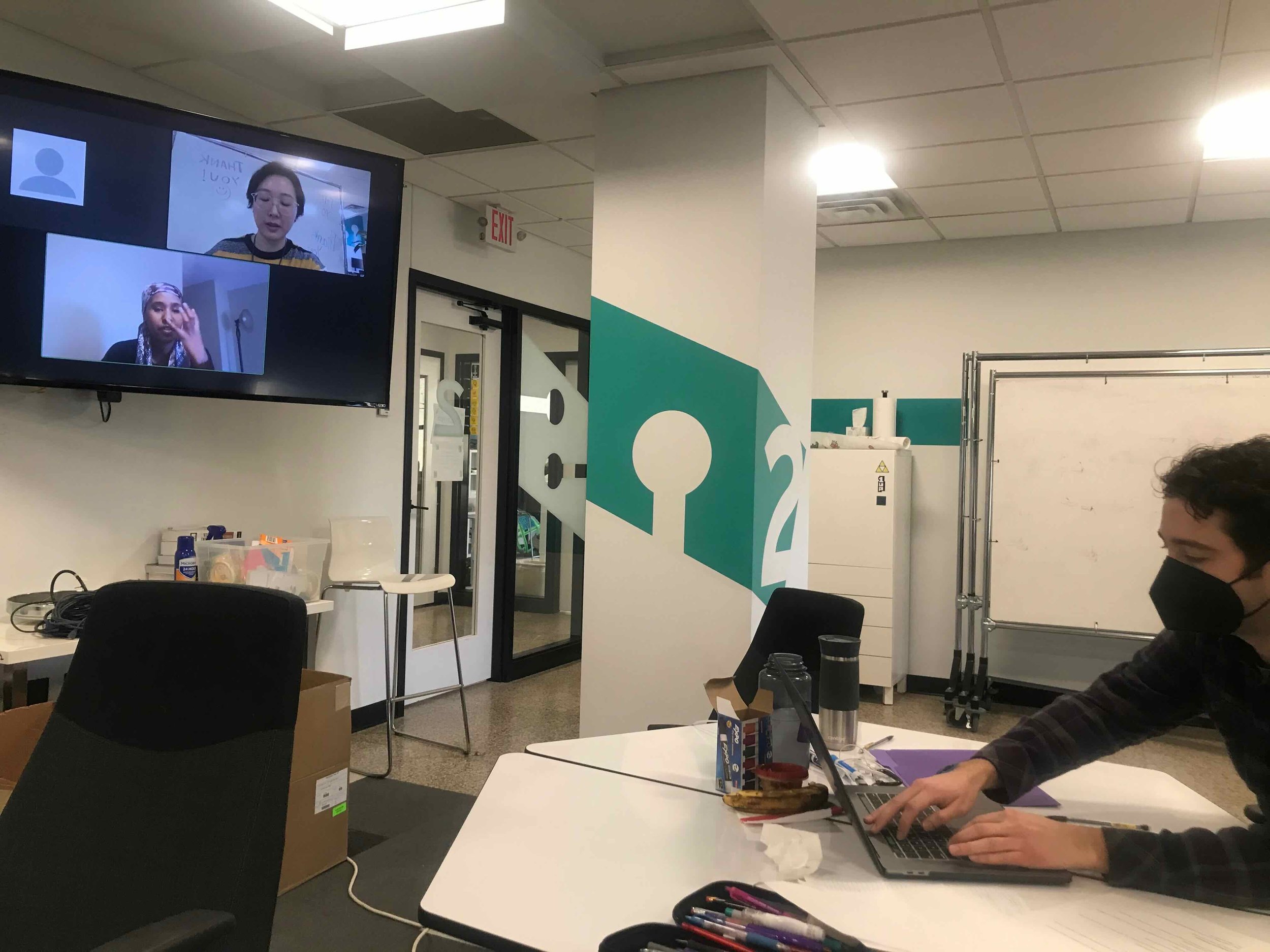
Usability Testing as a group, my teammate Justin pictured, taking notes.
Raw Data Figma whiteboard
Findings and recommendations
What worked well
11/11 users like the photos, colors, and vibe of the website.
11/11 users could find the donate button, use the donate form and submit a donation.
11/11 users prefer to donate online.
9/11 users were able to see and understand Hope's mission, values, and goals.
3/11 users said they aligned with Hope's mission, values, and goals.
Findings and recommendations page
Findings and recommendations page
Findings and recommendations page
Conclusion
Hope's website communicates well to the users their goals, mission, and values. However, the users had difficulty navigating the site and finding actionable ways to participate in Hope's programs. Users understood Hope's community work, and many felt that the site was attractive.
There are simple adjustments that Hope can make to help users navigate the site easier. They have my Findings and Recommendations Report to refer back to make adjustments or better understand their audience's needs.
It makes me very happy that Hope understands the value of working with a UX designer and researcher and has taken the initiative to do a website usability analysis.
Findings and Recommendation page

Findings and Recommendation page